Understanding the YouTube Music Web Player Redesign
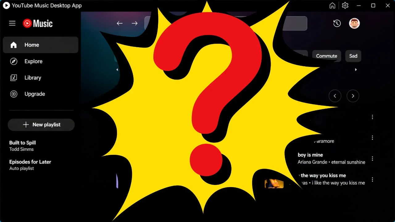
YouTube Music is rolling out a redesigned web interface that moves playback controls from the lower-left corner to the center of the bottom bar. The change has reached some users but not others, and those who received it hold mixed opinions about the new layout. This aesthetic update alters how desktop listeners interact with their audio queues, bringing the platform closer to the visual arrangement used by competing streaming services.
The desktop platform has long maintained a left-aligned configuration for standard media buttons, but this modification alters the entire bottom navigation strip. Users navigating the site on personal computers and laptops are noticing the shifts as Google deploys the changes incrementally. Because the adjustments alter muscle memory built over years of listening, the reception among early recipients involves both enthusiasm and frustration.
How the Bottom Bar Elements Have Shifted
The update effectively inverts the entire bottom bar of the desktop player. Playback controls for play, pause, and skip now sit in the center of the screen instead of the left side. Shuffle and loop buttons moved from the right side to join them in the middle. Meanwhile, artist name and song information shifted to the left, while like and dislike buttons slid over to the right. Volume controls remain in the far-right corner, making them the only element that stayed in place.
This layout reorganization splits the interface into three distinct zones. The song details and album artwork anchor the left side of the strip, the operational media commands cluster centrally, and the social engagement buttons alongside audio adjustments occupy the right side. Observers note that this structure mirrors the standard design language found across other major desktop web applications in the streaming industry.
The Gradual Server-Side Rollout Strategy
Google has been pushing this redesign gradually over several months. Reddit threads dating back to September show users reporting the new interface, and some comments claim they received it even earlier. However, Android Authority confirmed that the rollout remains inconsistent. Some staff accounts display the new layout while others still show the old version. The update appears tied to individual accounts rather than app versions, following Google's standard server-side A/B testing approach.
Server-side deployment allows technology companies to test new features on a subset of active accounts without requiring manual software downloads or browser updates. This method explains why two people using the same browser version on identical operating systems might see completely different user interfaces. Google has not announced a timeline for completing the rollout to all users, leaving the wider subscriber base waiting for the interface switch.
User Reactions and Functional Complaints
Early reactions among users who received the new interface are split. An Android Authority reader poll showed 26% of respondents liked the redesign, while 5% said they preferred the old layout. Among those still on the old interface, 57% expressed excitement about receiving the update, and 12% said they would rather keep what they have. Beyond visual preferences, some users raised functional complaints. Several reported that the progress bar feels less responsive than before. Others pointed out that the rearrangement broke compatibility with browser extensions they had been using to customize the YouTube Music experience.
Browser extensions often rely on fixed DOM structures and specific element identifiers to inject custom themes or extra shortcuts. When a platform reorganizes its HTML elements and CSS positioning, those extension scripts fail to locate the target buttons. This technical friction adds to the annoyance of listeners who relied on community-made add-ons to bridge gaps in the official web application features.
Broader Interface Updates Across YouTube Music in 2026
The web player redesign follows a string of interface updates Google has pushed across YouTube Music throughout 2026. The Now Playing screen received a split-view overhaul on Android and iOS in April. Album and playlist pages got an immersive header redesign in October. The Progressive Web App gained offline download support earlier in the year. And in January, YouTube Music added cross-device queue syncing that lets users resume playback from any device on any other device.
These continuous adjustments demonstrate a heavy product focus on unifying the listening experience across mobile apps, desktop browsers, and progressive web installations. Cross-device queue syncing solved a long-standing user request by maintaining playback state seamlessly when switching from a phone to a work computer. The visual overhauls on mobile and desktop aim to modernize the aesthetic presentation to match contemporary design trends.
What to Watch For as the Rollout Continues
As the deployment proceeds through server-side flags, users waiting for the centered layout should monitor their accounts for sudden interface changes without needing to clear browser caches or update extensions. Technical observers will also track whether Google addresses the responsiveness complaints regarding the progress bar or if community developers manage to patch their browser extensions to support the new element hierarchy. For now, listeners remain divided while the company measures engagement metrics and feedback from the active testing pool.