Understanding the New Google Messages App Icon
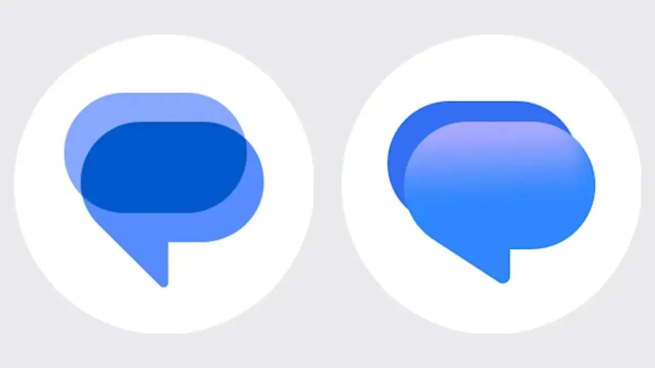
Google Messages is getting a fresh look. The latest beta introduces a completely redesigned app icon that swaps the familiar flat interlocking pills for a rounded speech bubble with a smooth blue gradient. The change arrived in Google Messages v20261030 beta and aligns the app with the gradient styling that Google has rolled out across its other apps.
The visual difference is immediately noticeable. Users who have updated to the latest beta version will see the new imagery across their app drawers and home screens immediately. This change marks a departure from the minimalist branding that characterized the platform for several years.
Technology companies frequently update their branding to stay modern and cohesive. Google has been systematically updating its product ecosystem to reflect a unified aesthetic. By introducing gradients and more dimensional shapes, the company aims to make its software suite feel more interconnected.
How the Old Design Compares to the New Gradient Look
The old icon used two horizontal pills in different shades of blue. Where they overlapped, a third tone appeared. It looked clean and minimal, but it was also abstract. Nothing about the design screamed messaging app unless you already knew what it was.
The new icon fixes that problem entirely. A plump, rounded speech bubble sits in the foreground, blending from a soft pinkish-blue at the top into vibrant royal blue at the bottom. Behind it, a smaller dark blue bubble peeks out at the upper left, suggesting an ongoing conversation.
This design makes the purpose of the software instantly clear to new users. Traditional chat applications often rely on communication metaphors like speech bubbles or paper airplanes to communicate utility at a glance. The previous abstract pill design lacked this immediate contextual clue.
Cross-Platform Rollout on Wear OS and Web
The redesigned icon already works on Wear OS smartwatches through the same beta version. It has also reached the web version of Google Messages, where users may need to reinstall the web app for the updated icon to appear. This cross-platform rollout prevents the icon mismatch that sometimes happens when Google updates one version before the others.
Maintaining visual consistency across mobile phones, smartwatches, and desktop web browsers is a major logistical task for software developers. Users who switch between devices benefit from recognizable branding that anchors their digital experience. The simultaneous release across hardware categories demonstrates a coordinated deployment strategy by the engineering team.
Smartwatch owners using Wear OS will find the new bubble aesthetic matches the modern watch face design guidelines. Meanwhile, web users interacting with the desktop client will see the updated graphic in their browser tabs and taskbars after completing the required refresh steps.
Redesigned Pinned Chats Interface in Beta
However, the icon change is not the only update arriving in the Messages beta. A redesigned pinned chats interface has started rolling out to beta users as well. The new layout features large contact photos displayed prominently at the top of the chat list.
Several users on the r/GoogleMessages subreddit confirmed receiving the update, though availability remains limited. Even within the beta program, the pinned chats UI appears to be controlled by a server-side switch. Simply installing the new beta does not guarantee access.
Pinning important conversations allows individuals to keep priority contacts easily accessible without scrolling through a busy message history. Highlighting these conversations with large profile pictures makes navigation faster and more intuitive. Beta testers are currently evaluating how this visual hierarchy impacts daily messaging habits.
New Floating Action Button and Search Changes
Additionally, at least one beta user spotted a new floating action button for Search at the bottom of the Messages home screen. The button sits alongside the existing Start Chat pill and comes in both expanded and collapsed versions.
Notably, the Gemini icon is absent from this new search button. According to earlier reports, Google plans to relocate the Gemini icon to the header, where it will replace the existing search icon. These layout adjustments demonstrate ongoing experimentation with user interface ergonomics.
Search functionality is critical for finding past information within extensive chat archives. Providing dedicated floating controls ensures that users can execute queries quickly from anywhere on the main message feed. Relocating artificial intelligence features to the header may also streamline how people access conversational assistance.
The Broader M3 Expressive Design Language
These changes fit into a broader visual refresh that Google has been building throughout 2026. The M3 Expressive design language has gradually spread across Google's apps, bringing brighter colors, playful animations, and more rounded elements.
Google Messages has received several pieces of this overhaul already, including a reworked compose bar, repositioned icons, and updated contact pages. Design systems dictate how buttons, text fields, and typography appear across an entire software portfolio.
Transitioning a massive user base to a new design language requires careful, phased deployment. By testing individual components like compose bars and contact pages before updating core branding, engineers can gather feedback and fix interface bugs early.
How to Access the Google Messages Beta Program
Google has not confirmed when the new gradient icon or the pinned chats redesign will reach the stable version of Messages. For now, both remain limited to beta testers.
Users who want to try the new look can join the Google Messages beta program through the Play Store. Joining the beta allows enthusiasts to test experimental features before they roll out to the general public.
Participation in testing programs also helps developers identify stability issues on diverse device hardware. While beta software can occasionally contain bugs, it provides an early look at the future direction of essential daily communication tools.