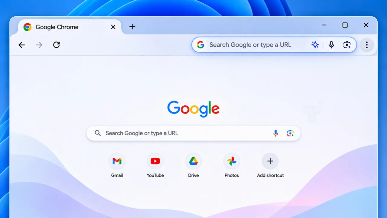
Google has added a searchable menu to Chrome's three-dot icon in the Canary build, a change that is part of the broader "WebUI Refresh 2026" redesign effort.
The new search bar sits at the top of the menu, allowing users to type a few letters and instantly see matching commands, bookmarks and recent pages, with results grouped by category for quick scanning.
Why the Change Matters for Chrome Users
For years the three-dot menu, officially called the App Menu, has been a long, unsorted list of settings, tools and actions. Users often had to click through multiple layers of submenus to locate a specific option such as "Clear browsing data" or "Site settings." The lack of a built-in search function meant that even power users relied on memory or trial and error. By embedding a search field directly in the menu, Google eliminates that friction and makes the browser's most frequently used controls reachable in seconds.
What the Search Bar Looks Like and How It Works
When the menu is opened, the search bar is pinned to the top and remains visible as the user scrolls. Typing any string triggers a live query that pulls results from three sources:
- Chrome commands (e.g., "Dark Mode", "Print").
- Bookmarks that match the entered text.
- Recent pages from the history list.
Each result appears under a heading that identifies its source, so a query for "dark" might show the Dark Mode toggle under "Settings" and a bookmarked article titled "Dark Sky API" under "Bookmarks." The feature was first demonstrated by browser tipster Leopeva64 on X, where the tipster noted that earlier Canary builds displayed the box but it was non-functional.
How the New Menu Fits Into the Larger "WebUI Refresh 2026" Project
Google has been quietly rebuilding Chrome's user interface under the internal code name "WebUI Refresh 2026," also referred to as "GlowUp." The initiative began in early 2024 with the goal of modernising Chrome's visual language, improving accessibility, and preparing the browser for upcoming web standards.
Key components of the refresh include:
- Animated navigation buttons that give tactile feedback.
- Deeper background colors that adapt to the user's chosen theme.
- Rounded blocks that group related menu items.
- A new scrollbar that replaces the hover-activated arrows that previously caused accidental scrolling.
The menu redesign is the most visible change so far because it is encountered every time a user clicks the three-dot icon. The old continuous list has been replaced by two clearly labelled sections: "Your Chrome" and "Tools and Actions." Each section is displayed in a rounded block that uses a slightly different shade of the user's theme color, creating visual separation without adding clutter.
Details of the New Layout and Navigation
At the very top of the menu, the three primary window-creation actions, New Tab, New Window and Incognito, are now rendered as large, button-style icons. This mirrors the design language used in Chrome's new tab page and makes the actions discoverable for novice users.
The middle of the menu contains the bulk of settings and tools, but unlike the previous version, only this middle section scrolls. The search bar stays fixed at the top, while "Settings," "Help" and "Exit" are anchored at the bottom, providing a stable reference point for users who need to close the browser or access help quickly.
Because the menu now uses a standard scrollbar, users who accidentally triggered the old hover-activated arrows while clicking will find the experience smoother. The scrollbar also supports touch gestures on devices with touchscreens, aligning Chrome's desktop UI with its mobile counterpart.
How to Enable the Feature and What Platforms Are Supported
The searchable menu is currently available only in Chrome Canary, Google's experimental channel that receives updates every few weeks. To try it, users must open chrome://flags and enable the flag named "App Menu Glow Up." Once enabled, the browser must be restarted.
At the time of writing, the feature works on Windows, macOS, Linux and ChromeOS. No official statement has been made about when the redesign will reach the stable channel, but Google's recent cadence of shipping experimental changes to stable within two-week cycles suggests that a broader rollout could happen within months of the flag's activation.
Potential Impact on Developers and Enterprise Users
For web developers, the refreshed UI does not change the underlying Chrome APIs, but the new visual hierarchy may affect how extensions interact with the App Menu. Extensions that add custom entries to the menu will now appear inside the rounded blocks, and developers should test their UI on Canary to ensure proper placement.
Enterprise administrators who manage Chrome policies across large fleets should be aware that the menu redesign could alter the way users locate settings such as "Password Manager" or "Site Settings." Training materials may need updating, and policy-enforced settings will continue to appear in the same locations, but the visual cues will differ.
What to Watch for in Future Updates
Google has not announced a final release date, but the company typically moves features from Canary to Dev, then to Beta before reaching stable. Users should monitor Chrome's release notes and the chrome://flags page for any new flags that tweak the menu's behavior, such as additional categorisation options or localisation improvements.
Because the "WebUI Refresh 2026" project is ongoing, further visual tweaks, like updated icons, more granular colour theming, or additional animation effects, are likely to appear in later Canary builds. Observers should also watch for accessibility audits, as Google has pledged to meet WCAG 2.2 AA standards for all new UI components.
In summary, the searchable three-dot menu marks a tangible step toward a cleaner, faster Chrome experience. By reducing the time required to locate settings and by aligning the menu with modern design principles, Google is addressing a long-standing usability complaint while laying the groundwork for future interface innovations.
In Chrome Canary, Google is testing removing the scroll arrows that let you automatically scroll to reveal hidden items when you hover over them in the 3-dot menu. They also added a scrollbar, and the search box at the top and the footer are now pinned so they are always visible: https://t.co/D7TxDkCtmP
— Leopeva64 (@Leopeva64) October 24, 2026