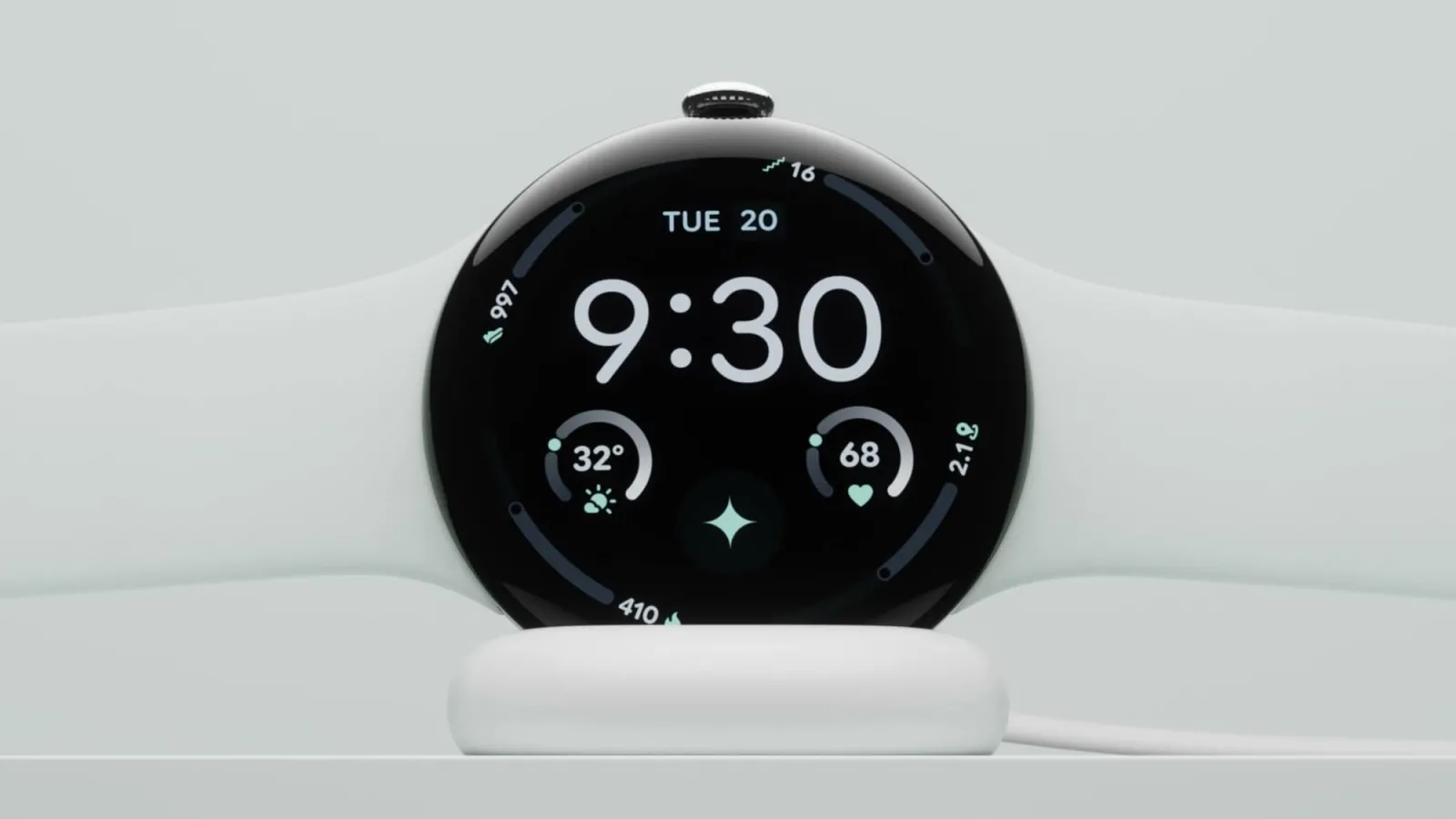
Google Tests New Wear OS Status Bar to Display Time and System Alerts
Google is testing a new status bar for Wear OS that could make smartwatches more consistent with Android phones. The feature appeared in the Wear OS 7.1 canary emulator. Google has also asked developers to test it and share their feedback.
Smartwatch operating systems have historically managed screen space differently from smartphones. Because wearable displays are small and round or square, every pixel matters. Designers have often prioritized edge-to-edge watch faces and application content over persistent top-level system indicators. Bringing a dedicated status bar to wrist devices marks a shift in how interface designers think about wearable software architecture.
How the New Wear OS Status Bar Works
The new status bar will appear at the top of the screen. It will display the current time and one important system status indicator. If several indicators are active, the system will show only the highest-priority icon.
Managing multiple system alerts on a tiny display presents distinct engineering challenges. Smartphones have ample room in their notification notches and punch holes for Wi-Fi, Bluetooth, battery percentages, and active privacy indicators. On a watch, showing all these elements at once would clutter the interface. By restricting the view to a single high-priority icon alongside the clock, the software maintains legibility without overwhelming the user.
Smart Space Management and Screen Constraints
However, smartwatch screens have limited space. Google has introduced several changes to prevent the status bar from taking up too much room. The bar will automatically disappear when users scroll through lists. It will return after two seconds of inactivity. Similarly, full-screen dialogs, including warning pop-ups, will hide the status bar.
Google has also considered screens that already display a clock. In such cases, the interface will avoid showing the time twice. Developers can also hide the status bar on specific screens if their apps need additional space.
This dynamic hiding mechanism ensures that utility does not compromise usability. When a user actively browses a menu or reads a message, the extra chrome vanishes. Once the user stops moving, the system quietly brings the status indicators back into view.
Key Benefits Outlined by Google
According to Google, the new feature offers several benefits:
- Visual consistency: The status bar will use consistent clock typography, placement, and background styling across the system and apps.
- System status indicators: It will display important information, including microphone and location activity, connectivity, battery status, and time. Only one status icon will appear at once, based on priority.
- Automatic scrolling and transitions: With Jetpack Compose for Wear OS 1.8, the status bar will hide during scrolling. It will reappear after two seconds of inactivity.
For now, the feature remains an experiment. It is available only in the Wear OS 7.1 canary emulator, not the standard emulator. Google will also exclude it from the actual Wear OS 7.1 release for smartwatches.
What Developer Feedback and Future Releases Mean
However, the feature could become part of Wear OS 8. This will likely depend on developer feedback and how well the changes work. Developers can find more details through Google's source documentation. It explains the changes to AppScaffold and ScreenScaffold.
Software developers building applications for wrist devices must adapt their layouts to accommodate these upcoming system-level changes. By updating frameworks like AppScaffold and ScreenScaffold, Google provides the underlying plumbing for apps to respect the new window insets. Software engineers examining the canary builds can test how their current app interfaces react when the status bar appears or disappears.
Broader Context of Wear OS Evolution
The evolution of smartwatch software has accelerated over recent years as hardware capabilities improve. Early wearable platforms focused strictly on basic notifications and standalone fitness tracking. Modern wrist computers run complex applications, handle local media playback, and manage secure payments.
Aligning the wearable interface more closely with smartphone design conventions helps reduce the learning curve for consumers. When users see familiar indicators for microphone access or location tracking on both their handset and their watch, the ecosystem feels more unified and trustworthy. Privacy indicators, in particular, have become a cornerstone of modern mobile platforms, letting users know instantly when hardware sensors are active.
Understanding Canary Emulators and Testing Channels
Testing experimental features through canary emulators allows software creators to trial radical interface updates without disrupting consumer devices. Canary builds represent early, unstable code branches where engineers test brand-new concepts. By releasing this code to developers first, the platform holder can catch rendering bugs, performance hitches, and layout issues early.
The deliberate decision to keep the status bar out of the standard emulator and the eventual production release of Wear OS 7.1 highlights a cautious approach. Google is not rushing a major visual change onto millions of wrists. Instead, the company is gathering telemetry and qualitative developer impressions to see if the concept deserves a permanent place in a future platform generation.